Press kit no. 748-49
Journalists, explore this publication-ready project. Create a free v2com media account to download high-resolution images.
Create a media account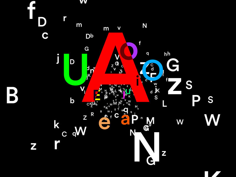
Press Kit | no. 748-49
The UQAM Centre de design and VOX Present ART + TYPO: an Exhibition on the Close and Intriguing Link Between art and Typography
UQAM Centre de design
The UQAM Centre de design and VOX centre de l'image contemporaine come together to present ART + TYPO. This exhibition has been specially developed by curators Angela Grauerholz (photographer) and Robert Fones (visual artist), two artists who share a long-standing interest in the history of typography, innovative experiments, art, and design.
ART + TYPO presents works by fifteen artists, including six at the Centre de design who use typography in innovative ways in their artistic practice. The exhibition turns the spotlight on two disciplines rarely addressed together: art and typography.
The exhibition crosses disciplines, but focuses above all on typography as a formal and expressive art form, essentially driven by research and a deep engagement with language, materiality, and conceptual forms.
Typographic characters began to be used in art at the beginning of the 20th century, when Picasso and Braque introduced letters into their paintings, using industrially manufactured metal stencils. Typography has also been an essential element in the artwork of graphic design artists and writers associated with futurism, such as the Dada movement and Russian Constructivism. In the 1950s and 1960s, pop art and the conceptual art movement initiated a new resurgence of typography in art, integrating advertising, signage, and political, literary, and philosophical texts into their work.
ART + TYPO focuses on art that incorporates the mechanically reproducible form of typography. However, some of the works in the exhibition do not fit easily into this category. This contradiction reflects the living nature of typographic forms, which is underpinned by their many variations.
Together, the Centre de design and VOX are also presenting a number of important historical precedents in the form of printed books, as well as an extensive documentation. The curators consider the production of exhibitions to be part of their practice and have therefore included their own work in the exhibition. They have also included works from their private collections.
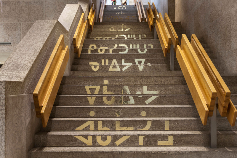
An in situ work in the UQAM Design pavilion staircase and at VOX
Cree artist Joi T. Arcand contributes to the exhibition with the work ᐁᑳᐏᔭ ᐋᑲᔮᓯᒧ Don't Speak English, which incorporates vinyl lettering applied to the staircase of UQAM's Design pavilion, and a neon sign installed at VOX. Both feature Cree syllabic characters. It represents not only an important statement about languages - especially indigenous language - but Arcand also offers an invitation to discover her own exploration and struggle to learn her community's language of Plains Cree as a way "to bring awareness to the precarious state of many Indegenous languages." The messages can be read by those who know the Cree alphabet, but are also addressed to those who cannot. Arcand's use of the vernacular language introduces a subtle humor by appropriating these common elements, past and present, found in our western environments. This subtle and intelligent humor is also found in the small poster of her Cree “Comic Sans” alphabet, as if suggesting that there would be a serif version of the Cree alphabet.
joitarcand.com
Artists at the UQAM Centre de design
Visual artist Robert Fones has been working with letterforms and typography throughout his career. He has often used letterforms for their historical references, overlaid with photographic images that suggest a narrative separate from the historical association of the typeface. Often these photographic images are restricted or cut off by the outline of the letterform, as if the letterform were a window through which one is looking at a historical narrative. For Fones, the typeface and the image are both vehicles for cultural forms traveling through time, each with its own historical origin and associations. Fones has employed various strategies for disrupting the recognizability of letterforms or the process of reading. These strategies range from increasing the size of type to a monumental scale, and rotating letterforms and painting them with colours based on their forms, to allowing letters in text to flow together or be arbitrarily disjointed. Through these devices, Fones hopes to draw attention to the inherent message carried by both the typeface, the photographic image (if used), and the text itself that he often draws from literary sources. He also wants to allow the viewer to become aware of their own interpretation of the combined forms that are presented to them.
Photographer Angela Grauerholz appropriates examples of characters found in a catalogue published by the Imprimerie nationale de France and offers twenty black and white photograms. Attracted by the beauty of different textures and the consistency of the presentation of these catalogue pages, the artist has chosen to copy some of the most ancient languages and writings that almost all disappeared today. The decision to title them with the German word Schriftbilder becomes obvious when one understands its literal translation, ‘’writing image’’, which tells us how they could be read today. Printing the pages through photographic means (re)iterates the idea of their being images. They become reminders of the former existence of these ancient languages and writings, brought back to life in another form and another context. Interpreting these texts or understanding their origins is impossible for the lay person and must remain a mystery, a theme that runs through many of the artist’s work. The loss of languages is a reminder that type does not preserve a language if there are no longer any speakers to speak it. Typefaces in the collection of the Imprimerie Nationale can only preserve the appearance of the language, not the living language itself.
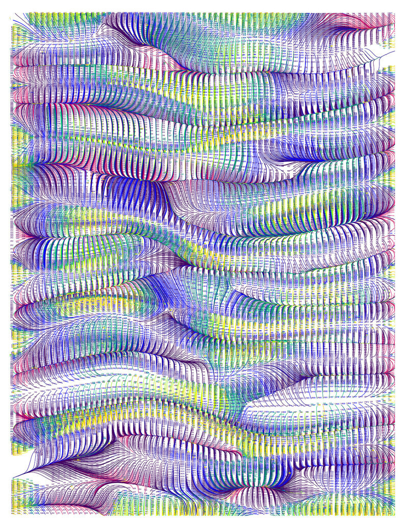
The German graphic designer Anette Lenz who lives and work in Paris, is one of the most influential designers today. In 2020, she was given the opportunity to transform the whole Museum Angewandte Kunst in Frankfurt (Germany) into one colossal and highly immersive graphic world, her world, a culmination of her experience and expertise. The result was an exceedingly sophisticated game of ever-new interrelationships between information and imagery: playing with superimposition, three-dimensionality, and spatiality, and drawing inspiration from a wide variety of materials and media. These theatrical installations reflect Lenz’s process-driven design practice, which—rather than turning the viewers into consumers—offers us an opportunity to become participants in the inventive play with type, colour, graphics, photography, and film animation etc.
Originally a graphic designer, Arnaud Maggs was interested in the subtle differences between similar things. This interest led him to take sequential frontal and profile photographs of friends and people he admired, build a collection of white porcelain jugs, and photograph Parisian hotel signs in 1991. The subtle differences between things within each category revealed the passage of time, the unique details of different manufacturers, and the distinguishing characteristics of serif and sans-serif type design. As a graphic designer, Maggs was very interested in the history of typography and collected numerous examples of graphic design and type specimen books. He brought many of his design skills to his art, producing many works that were either strictly typographic, such as The Complete Prestige Jazz Series, or showcased graphic designs from the past that evoked social, cultural, or industrial histories.
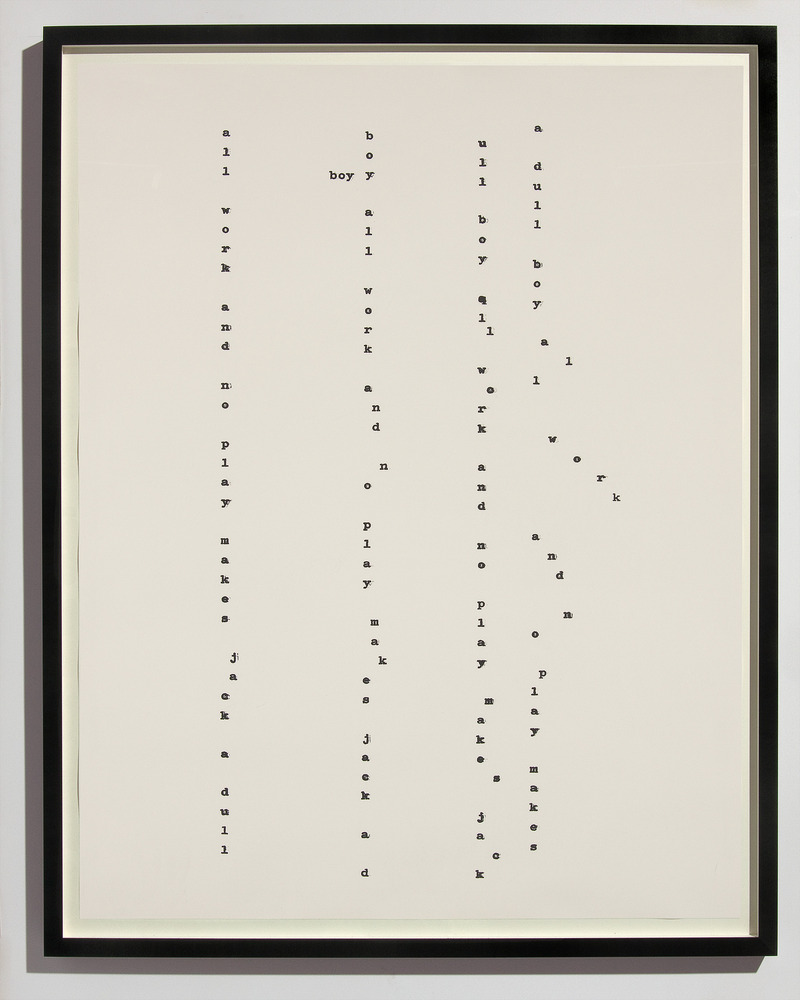
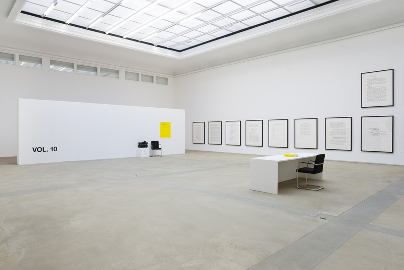
Remarkable works by artist and editor Klaus Scherübel stand at an ambivalent position at the frontier between conceptual art and visual experimental writing form, layering multiple modern and modernist paradigms. In his works, which are often textual using a diversity of media such as photography, video, paint, installation, publication, and exhibition, Scherübel questions the artistic activity, his representations, his production conditions, as well as reception. In reference to a book in multiple components, his achievements are now organized in ‘’volumes’’ including the production of artworks, as well as specific interventions, exhibitions, or publications.
Activities at the UQAM Centre de design
Nuit blanche à Montréal
As part of the exhibition ART + TYPO, night owls can participate in a playful workshop for free on the theme of typography and art. Families and children are welcome.
Date: March 2 2024
6 p.m. to 1 a.m.
Guided tours of the exhibitions for groups
Offered at all times free of charge.
Reservations are required via the email address centre.design@uqam.ca
Partners
Conseil des arts et des lettres du Québec
UQAM | École de design
Institut Goethe Montréal
MP Repro
v2com
ART + TYPO at VOX centre de l’image contemporaine
Dates: February 23 to June 22 2024
Opening night: February 22 at 5 p.m.
Artists: Joi T. Arcand, Matt Donovan and Hallie Siegel, Robert Fones, Hamlet
Lavastida, Kelly Mark, Judith Poirier, Allen Ruppersberg, Charles Sandison,
karen elaine spencer, David Tomas
Technical sheet
Dates: From February 22 to April 14 2024
Opening night: Wednesday, February 21 at 6 p.m.
Curators: Angela Grauerholz and Robert Fones
UQAM Centre de design
1440, Sanguinet Street
Montreal
Berri-UQAM station
Wednesday - Sunday 12 p.m. to 6 p.m.
Free entry
Information
Telephone number: 514 987-3395
centre.design@uqam.ca
VOX centre de l’image contemporaine
2, Sainte-Catherine St. (4th floor)
Montreal
Saint-Laurent station
Tuesday - Saturday, 11 a.m. to 5 p.m.
Free entry
Information
Phone number: 514 390-0382
info@centrevox.ca
About The Design Center of the University of Quebec in Montreal
The Design Center of the University of Quebec in Montreal is one of the only venues in Canada that presents exhibitions that illustrate historical and current trends in the fields of graphic, industrial, and urban design, as well as architecture and fashion.
Founded in 1981 on the initiative of professors from the UQAM School of Design, the Center has produced more than 350 exhibitions aimed at professional design circles, as well as students and the general public. For more than 40 years, it has contributed to the development of a culture in design and its local and international influence, both through the prestigious exhibitions it hosts, and through the creation of numerous traveling exhibitions presented in more than ten countries, dedicated mainly to the recognition of Quebec design.
Located in downtown Montreal, in the heart of the Latin Quarter and the Quartier des spectacles, it welcomes visitors free of charge in its 400 square meters of exhibition space, where it offers conferences and organizes special events from September to June.
For more information
Media contact
- Centre de design de l'UQAM
-
Julie Meunier
Communication consultant
Press relations and special events division
Communications service - meunier.julie@uqam.ca
- 514 895-0134
Attachments
Terms and conditions
For immediate release
All photos must be published with proper credit. Please reference v2com as the source whenever possible. We always appreciate receiving PDF copies of your articles.
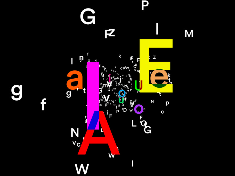
Anette Lenz, Images taken from the interactive installation Constellation Voyelles n°1, 2024
Very High-resolution image : 50.0 x 37.5 @ 300dpi ~ 2.5 MB

Very High-resolution image : 50.0 x 37.5 @ 300dpi ~ 2.8 MB
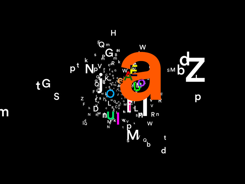
Very High-resolution image : 50.0 x 37.5 @ 300dpi ~ 2.4 MB
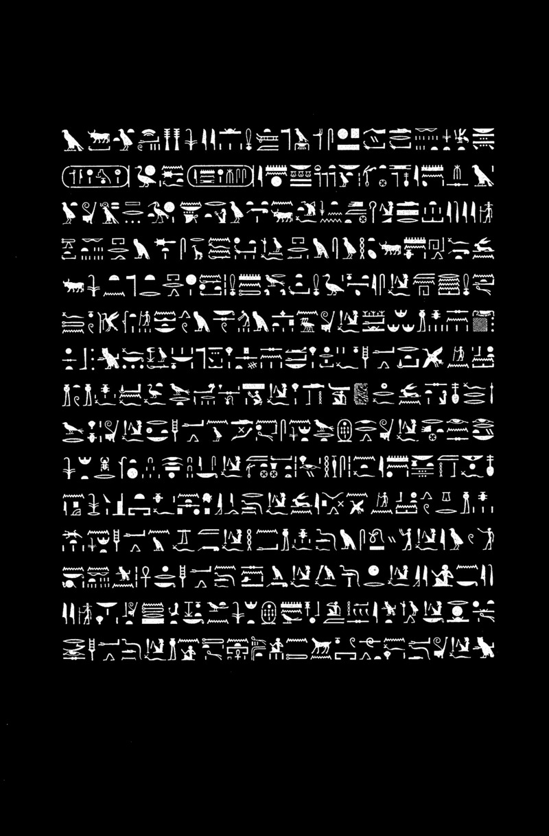
Hiéroglyphes, extract from Schriftbilder
1999
20 photograms, gelatin silver print
40,6 x 51 cm (framed: 48,3 x 61 cm)
Medium-resolution image : 6.56 x 9.99 @ 300dpi ~ 690 KB
Angela Grauerholz
L’écriture Nägarï, extract from Schriftbilder
1999
20 photograms, gelatin silver print
40,6 x 51 cm (framed: 48,3 x 61 cm)
Medium-resolution image : 6.49 x 10.06 @ 300dpi ~ 1 MB
Angela Grauerholz
L’écriture phagpa, extract from Schriftbilder
1999
20 photograms, gelatin silver print
40,6 x 51 cm (framed: 48,3 x 61 cm)
Medium-resolution image : 6.5 x 10.02 @ 300dpi ~ 930 KB
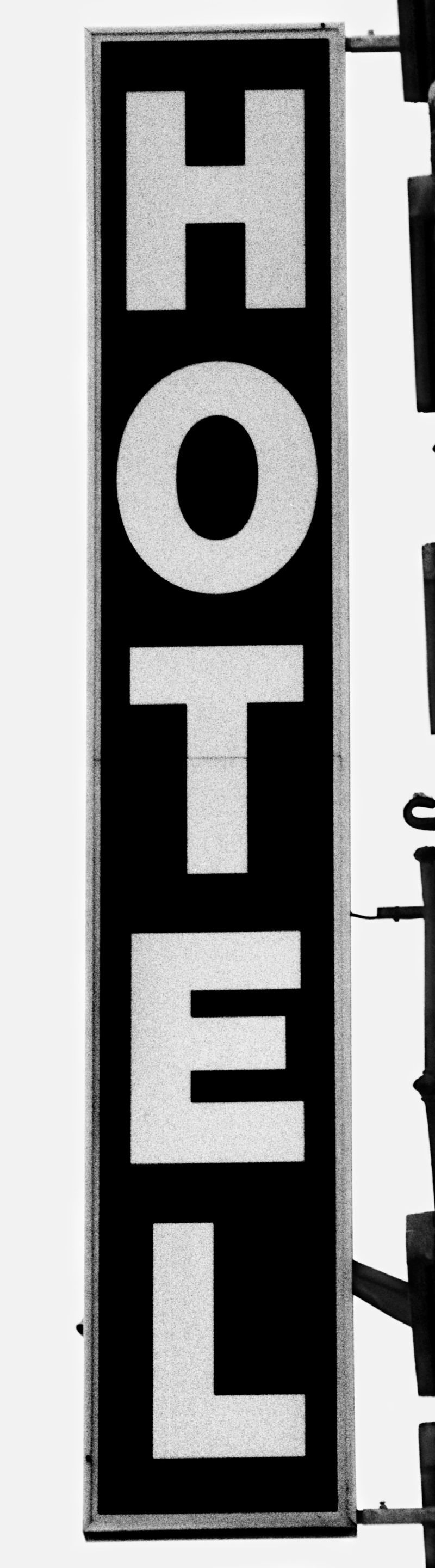
Arnaud Maggs
Hotel,
77, avenue de St.- Ouen, 17e
1991
185,1 × 53 cm
Very High-resolution image : 10.0 x 36.0 @ 300dpi ~ 5.1 MB
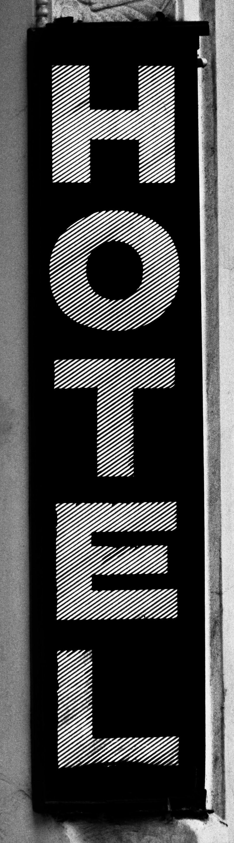
Arnaud Maggs
Hotel
7, rue du Général - Beuret, 15e
1991
Gelatin silver print
185,1 × 53 cm
Very High-resolution image : 10.0 x 36.0 @ 300dpi ~ 9 MB
Joi T. Arcand
êkawiya âkayâsîmo / Don't Speak English
2017
Very High-resolution image : 18.0 x 12.0 @ 300dpi ~ 9.1 MB
Klaus Scherübel
Jack Torrance’s All Work and No Play #23
2006-2008
Medium-resolution image : 5.91 x 7.39 @ 300dpi ~ 1.9 MB
Klaus Scherübel
Reconsidering Jack Torrance’s All Work and No Play
2006-2008
High-resolution image : 11.81 x 7.88 @ 300dpi ~ 3 MB
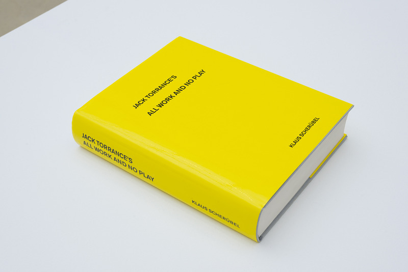
Klaus Scherübel
Jack Torrance’s All Work and No Play
2006-2008
600 pages, 28,5 × 23 × 6 cm
Medium-resolution image : 8.85 x 5.91 @ 300dpi ~ 1.2 MB
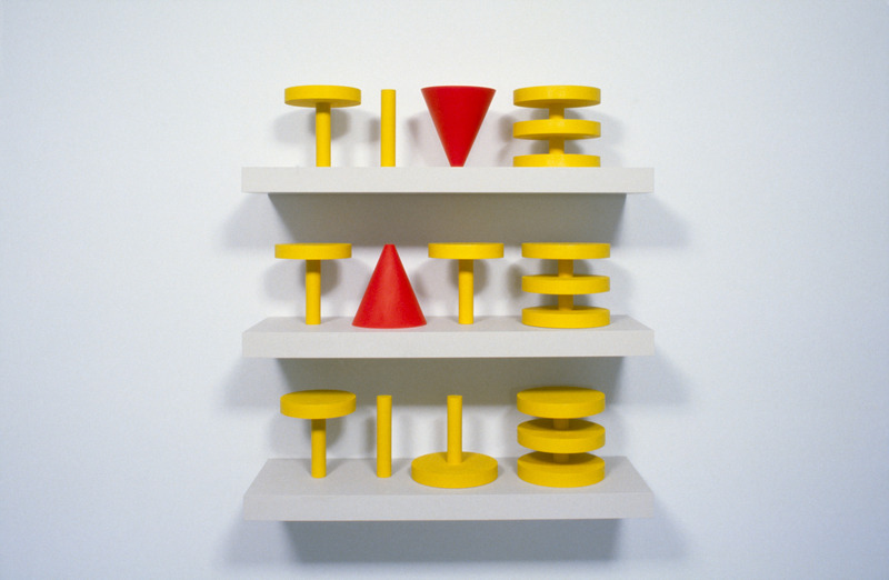
Robert Fones
Tive/Tate/Tile
1997
97,15 × 91,44 × 30,48 cm
High-resolution image : 14.58 x 9.51 @ 300dpi ~ 5.8 MB
Advertising
You may also like...

Montreal, Canada, 2022-11-23
Prefabrication Perspectives: Architecture Off the Assembly Line
UQAM Centre de design
Montréal, Canada, 2021-11-22
The UQAM Centre de Design Presents the Exhibition Pier Luigi Nervi: Master Designer-Builder
UQAM Centre de design
Pinehouse, Canada, 2021-09-14
The UQAM Centre de Design presents the exhibition "Vers un imaginaire numérique"
UQAM Centre de design

Montréal, Canada, 2017-02-02
Journey into the World of Italian Graphic Designer Heinz Waibl at the UQAM Centre de Design
UQAM Centre de Design
Lugano, Switzerland, 2026-07-02
6ª biennale svizzera del territorio
Istituto Internazionale di Architettura
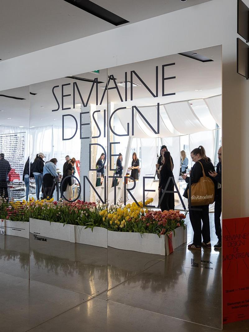
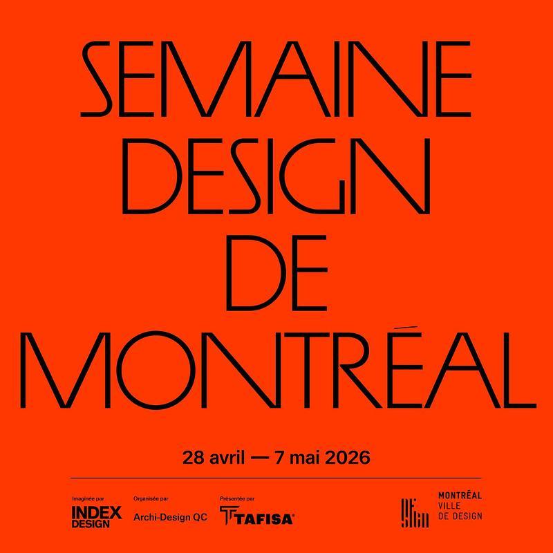
Montreal, Canada, 2026-05-13
Montréal Design Week Makes a Powerful Debut
Index-Design and Archi-Design QC
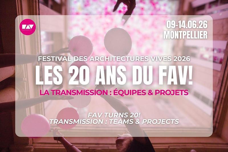
Montpellier, France, 2026-04-27
Festival des Architectures Vives 2026: Teams and Projects
Association Champ Libre
Montreal, Canada, 2026-03-31
Montreal Unveils Its Design Week With a Striking Citywide Program
Index-Design et Archi-Design QC
Copenhagen, Denmark, 2026-02-17
Imagining the Future - Through Architecture and Design
Royal Danish Academy – Architecture, Design, and Conservation
Toronto, Canada, 2026-01-06